

Data Analytics - Final Week


Stock Data Pre-Processing
import pandas as pd

code = pd.read_csv('./data/corpgeneral.csv')

# Extraction
code = code[['회사명', '종목코드']]

# Renaming columns
code_result = code.rename(columns={'회사명': 'corp', '종목코드': 'code'})

corp_name = "카카오"
condition = "corp=='{}'".format(corp_name)

kakao = code_result.query(condition)
kakao = kakao['code']
kakao_string = kakao.to_string(index=False)
kakao_string = kakao_string.strip()
kakao_string = kakao_string.rjust(6, '0') # Adjusting to six digits, replacing blanks with 0
kakao_code = kakao_string

# Downloading pandas_datareader
conda install -c anaconda pandas-datareader

# Extracting data from the internet
import pandas_datareader.data as web
kakao_stock_df = web.DataReader(kakao_code, 'naver')

# change data type to int (makes it easier to edit)
kakao_stock_df['Close'] = kakao_stock_df['Close'].astype(int)

# .plot() (easier way to graph. but you cannot customize)
kakao_stock_df['Close'].plot()

from datetime import datetime
Create function
def get_code(code_result, corp_name):
    condition = "corp=='{}'".format(corp_name)
    code = code_result.query(condition)['code'].to_string(index=False)
    code = code.strip()
    code = code.rjust(6, '0')

    return code

samsung_code = get_code(code_result, "삼성전자")

# create list
companies = ['삼성전자', 'LG전자', '카카오', 'NAVER', 'CJ', '한화', '현대자동차', '기아자동차']

# creating dates
start = datetime(2020,1,1)
end = datetime(2020,12,31)

# extract data from the dates
stock_of_companies = pd.DataFrame({'Date':pd.date_range(start=start, end=end)})

# Processing
for company in companies:
    company_code = get_code(code_result, company)
    stock_df = web.DataReader(company_code, 'naver', start, end)
    stock_of_companies = stock_of_companies.join(pd.DataFrame(stock_df['Close'].astype(int)).rename(columns={'Close':company}), on='Date')
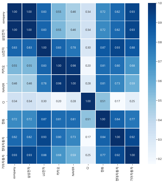
Correlation
What is correlation?
It is the relationship between datasets. If data B increases as data A increases, they have a positive correlation. If data B goess through no change as data A increases, they have no correlation. If data B decreases as data A increases, they have a negative correlation.
code
import matplotlib.pyplot as plt
import seaborn as sns

plt.rcParams['font.family'] = 'Malgun Gothic'
plt.rcParams['axes.unicode_minus'] = False

# correlation
corr_data = stock_of_companies.corr()

# graph
plt.figure(figsize=(5,3))
sns.lineplot(data=kakao_stock_df['Close'])

# hitmap
plt.figure(figsize=(10, 10))
sns.heatmap(data = corr_data, annot=True, fmt = '.2f', linewidths=.5, cmap='Blues')
result
Thoughts
It wasn't as grandiose(?) as I thought it would be, I kind of think it might've been a waste of time as I barely learned anything from the online lecture. But, the fact that I got to know the processes data scientists go through, like preprocessing, is definitely worth something at least. I was hoping to use the knowledge I learned for the AI skillsets I got from the previous month, but my level is too low for that. I think in the future, if I look back, I will consider this time as being productive, I guess.